Gender distribution of artists in MoMA's collection
* There are three artists categorized as "non-binary" in the collection, which is not discernible due to its small proportion.
"To see takes time"
- Geogria O'Keeffe
The exhibition, currently on view at the Museum of Modern Art (MoMA), titled with the above quote by Georgia O'Keeffe features the artist's work that illustrates her iterative creative approach. From the beginning of her artistic career, O'Keeffe drew and painted the same subjects repeatedly until she was able to perfectly capture their essence.
In her epistolary correspondences with her contemporaries, O'Keeffe is reported to have produced numerous drawings of the same subject sometimes overnight, sometimes over a span of decades. She experimented with different media, colors and compositions in search of the right mood, texture and tone.
These repetitions and continuous gaze were her attempts in understanding her subject to distill its inner quality. Gathered in the exhibition are a series of her works that show the progress from observation to abstraction.
While I was browsing through her wonderful drawings in charcoal, pastel and watercolor, my mind kept drifting to data visualization.
Abstraction is a necessary process in data visualization to transform data into visual elements that convey complex information in an easy-to-understand manner. During this process, however, individuals become data points in a sea of data, stripped of distinctiveness and unique experiences. They are grouped into categories, approximate to their original identities, to be processed, analyzed and visualized. This reduction of complexity inherently extracts any personal qualities, making it difficult to create an evocative visualization.
Take for example the following area map that represents the number of artists in the MoMA's permanent collection by gender.
I originally created the chart as part of the final project for the Advanced Interactive Data Visualization Studio course during the Spring 2022 semester at CUNY Graduate Center. The objective of the project was to visualize disparities in gender and nationality among the artists in the museum's collection.
Since many art institutions in the United States started participating in Open Access initiatives and have made data of public-domain artworks in their collections publicly available, scholars and researchers have worked on similar projects.
One such example is an event organized and hosted by the National Gallery of Art (NGA), Coding our Collection: The National Gallery of Art Datathon, in which the museum collaborated with researchers to analyze their permanent collection data. Various institutions participated in this event and created dashboards that examine the NGA's data with different focus.
One of the teams charted the history of acquisitions, and created a graph that visualizes the gender distribution of artworks made by male, female, or unknown gender. Another team produced a dashboard, Diversity on Display: Who's on the Wall at NGA?, that shows "the artist gender identity, race/ethnicity, and geographical distribution of the NGA collection objects that are on public view over time on a chosen museum floor."
These projects and my treemap for the Spring 2022 course succeeded in visualizing the overwhelming gender disparity among the artists in the museums' collections. Yet that's all they do. They merely display the gender gap, a comparison between male and non-male(s).
Having worked on the gender area map for the Advanced Interactive Data Visualization Studio course and researching similar projects motivated me to think about how to more creatively represent gender disparity and push the conversation beyond "there are more male than female."
What qualities does a visualization need for it to leave the audience with more questions than answers? How can the experience go beyond just acknowledging the disparity? How can I make a visualization that can be felt as well as be seen?
Visualizations that appeal to emotions are capable of telling a story at an individual level while simultaneously portraying a larger picture.
Data are and must be aggregate in order for them to be useful. From this aggregate quality, patterns and trends emerge, lending them their rhetorical power. Yet conveying information at a macro level alone seldom brings out empathy in the audience. It's like hearing news about a major earthquake that killed thousands of people in a faraway place that you have never visited. You may empathize for a brief moment after you hear the news, yet quickly move on with your daily life.
When thinking about visualizing the gender disparity among the artists in MoMA's permanent collection, the first name variable, instead of the gender variable, brings the data much closer to the audience. The following bubble chart displays the 30 most common first names among the artists in MoMA's permanent collection.
Instead of laying out all 30 names at once, it unveils them one by one. By using the first name, which is a more personal variable than the gender values, along with the delayed effect, it affords the audience time to understand what's unfolding in front of them and to make connections between the infographic and their own individual experiences and memories.
The gradual reveal of the data also helps to shift the passive reception of information into active thinking, instigating a further exploration on the subject of gender. The amount of time it takes for the first female name to appear adds to the reveal of the intention of the chart. With the introduction of an anomaly, one starts to see hegemony and disparity. A visualization that helps the viewer realize the disparity on their own, rather than simply illustrates it for them, is more impactful.
In this regard, intentionally perplexing visualization may be effective in aiding the viewer to reach their own understanding of a visualization.
The video is not a data visualization in a conventional sense, and may risk not being fully understood before the viewer's attention span runs out. Yet by not only visualizing but also performing the data, it pushes the boundary of data visualization. My hope is that, at the end of the video, the viewer realizes that the first 2 and a half minutes of male names being called out is actually a void of diversity.
Similarly, illustrating the lack of presence has an analogous effect.
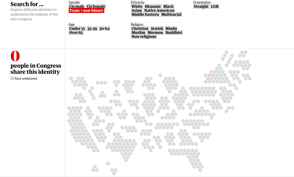
In the interactive map of congress the Guardian published in the article, How diverse is the 2018 US Congress?, one can select different identities such as ethnicity, age, religion, and gender. Depending on the identities selected, it displays the number of people in congress that share the same identity.
When "Trans + non-binary" is selected, it displays "0 people in Congress share this identity" and the map grays out.
This is a powerful visualization that contextualizes the lack of gender diversity among the members of congress in the United States. By revealing how many legislators - 535 individuals who should represent the U.S. population - share the same identity as the audience, the abstract idea of political representatives becomes more personal.
Another project that creatively makes visible what does not exist is the Library of Missing Datasets by Mimi Ọnụọha. It is a web site and an art object, rather than a two-dimensional visualization. The art object is a file cabinet filled with folders labeled with phrases like "People excluded from public housing because of criminal records," "Mobility for older adults with physical disabilities or cognitive impairments," and "Total number of local and state police departments using stingray phone trackers (IMSI-catchers)."
This project not only innovatively visualizes voids but also leads the audience to question why these data are missing and how decisions about which data gets included or excluded are made. Our society is full of classifications such as these. In fact, it could not function without it. Who can vote, who can drive, which public bathroom one can use, on what day garbage gets collected in each neighborhood. Yet as prevalent as they are in our society, most of these classifications are so well integrated in our lives, they are often invisible. With invisibility, they become a powerful and sometimes oppressive social order.
On a recent bus ride during my morning commute, I sat next to a man, who appeared to be in his mid- to late-50s, dressed in a suit and a tie. A few minutes after I sat down, he pulled out his phone from his bag, which I distinctly noticed as a "woman's purse." While I did not make any remarks to him, I vividly remember thinking to myself "huh, he has a purse." Then it dawned on me that my own, almost unconscious observation was so very colored by the gender binary that has been inculcated in me. After all, it is absurd that bags are gendered. Yet it is often the case. When one shops online for bags, shoes, clothes, jewelry, perfumes, the gender is usually the first filter that we use to navigate to "appropriate" products.
The invisible and insidious gender classification causes much struggle for those who do not identify as neither male nor female. Every binary gender choice they are forced to make is a self-erasing experience. This century-old practice also puts to question the accuracy of the gender data we collect. Even if I succeeded in visualizing gender disparity innovatively, if the data itself inaccurately captures the gender distributions, it does little to deepen our understanding of gender nor further the conversation around gender equality.
In fact, the rigid binary gender system makes our understanding of gender faulty and unscientific. By now, a fair amount of people believe that gender is not strictly binary, but how many of us truly know the level of its complexity? The visualization featured in the September 2017 issue of Scientific American illustrates just how intricate gender and sex are.

To create the diagram, Amanda Montañez, a designer for the publication, began working by rejecting much of the existing data and research about sex and gender based on flawed categories or flawed collection practices. Beyond XX and XY uses a color spectrum to represent the sex spectrum, a vertical axis to represent change over time, and branching arrows to connect to text blocks that provide additional contextual information. The diagram excellently disproves the scientifically incorrect idea that there are only two sexes, and even that the concepts of sex and gender are fully distinguishable. Montañez reversed the general approach to data visualization of reducing complexity, and created an intentionally complex, nuanced and just diagram that challenges the simple, oppressive ideas.
A visualization like this makes us realize that we don't know enough about gender to abstract the gender data properly. We first need to spend more time exploring and learning the complexity of gender and to familiarize ourselves with it.
With increasing discussions and efforts to push gender beyond the rigid binary values, we are starting to see data collection methods that offer more than two traditional values for gender. One such example is a survey developed by Public Health England in collaboration with LGBTQ+ organizations in the United Kingdom. It was designed for use in routine national surveillance of HIV in England and Wales to determine self-identified gender and cis or trans status in a public health context. For the question 'How do you identify your gender?' one can select from five different choices: 'Woman (including trans woman)', 'Man (including trans man)', 'Non-binary', 'In another way', and 'Prefer not to say'.
While surveys like this are a step forward for non-binary populations to be counted, we need to push the conversation about gender further as our understanding of gender as well as its definition are evolving. The American Medical Association now calls gender a "spectrum" rather than a binary, meaning that there is no discreet delineation between each gender. Moreover, some people are gender-fluid, with their "gender identity shifting from day to day, year to year, or situation to situation."
If our society were to move towards this line of thought, what would gender data look like? It certainly will not be binary data. It may not even be categorical data. Because if we understood gender to be flexible and fluid that could change over time, no list of choices will suffice regardless of how long that list is.
It then becomes a question of technological capability we have at hand. The technologies today operate by means of exclusion. It can make sense of data by putting them into distinct categories and finding similarities and differences between data points. Its limitation, however, is not of a technical nature but a conceptual one. Its mode of operation is a reflection of how we, the developers of technology, see and make sense of the world around us.
We comprehend an object or a concept by identifying its unique qualities, by finding things that set it apart from the others, or its proximity to them. Wrapping our heads around the concept of fluid gender is as dizzying as imagining the edge of the universe. Trying to capture something that's simultaneously nothing and everything seems daunting and impossible. The aforementioned system of classifications indeed has a tight grip on our ways of understanding the world. Fundamentally changing the way we make sense of it is most definitely challenging, but not impossible.
While the Global North pushes the boundary of gender definition, in the rest of the world gender is still very much a social construct. And gender inequalities occur as a result.
Girls in most parts of the world are twice less likely than boys of the same age to have access to the internet or digital skills.
HIV epidemic is influenced by gender inequalities as girls are not as likely to be educated about protection against sexually transmitted diseases.
As climate change exacerbates and access to clean water becomes scarcer, more girls will likely miss out on school because water fetching duty disproportionately falls on women and girls.
There is enough list of gender inequalities like these to fill a whole research paper. Challenging the rigid gender binary is necessary and important. Yet just as important is continued efforts to collect conventional gender data so that we could have disaggregated data to analyze in order to see where gender inequalities occur.
It is also crucial to anticipate the possibility that, in many parts of the world, gender may never become a non-binary category. Being able to live in a society that allows serious debates over the changing definition of gender, regardless of civil or insolent, without political, religious or cultural persecution is an extreme privilege. Those, who live in such a society, should always keep in mind that not everyone - in fact the majority of people across the globe - are afforded the same privilege. Discussing how to address this regional tension is absolutely necessary for us to make progress towards true gender equality.
To bring about genuinely equitable data practices that don't create and perpetuate hierarchy among different forms of gender, we must first acknowledge that our understanding of gender needs to significantly expand. To move away from the existing complacent approach to dealing with gender data, it's imperative to involve more than the progressives in the Global North in the conversations around gender and in the development of technologies that enable collection and analysis of more inclusive data.
To play on the quote by Georgia O'Keeffe, to see, to understand and to visualize takes time. As the artist repeatedly and continuously confronted her subjects until she gained familiarity with them, we need to engage in ongoing, inclusive discussions about gender so that we can better understand it.
We have just scratched the surface of comprehending gender and its heterogeneity. Underneath the epidermis are idiosyncrasies that enrich our world.